
diff options
| author |  Héctor Ramón Jiménez <hector0193@gmail.com> Héctor Ramón Jiménez <hector0193@gmail.com> | 2023-03-04 05:37:11 +0100 |
|---|---|---|
| committer | Héctor Ramón Jiménez <hector0193@gmail.com> | 2023-03-04 05:37:11 +0100 |
| commit | 3a0d34c0240f4421737a6a08761f99d6f8140d02 (patch) | |
| tree | c9a4a6b8e9c1db1b8fcd05bc98e3f131d5ef4bd5 /native/src/widget/checkbox.rs | |
| parent | c54409d1711e1f615c7ea4b02c082954e340632a (diff) | |
| download | iced-3a0d34c0240f4421737a6a08761f99d6f8140d02.tar.gz iced-3a0d34c0240f4421737a6a08761f99d6f8140d02.tar.bz2 iced-3a0d34c0240f4421737a6a08761f99d6f8140d02.zip | |
Create `iced_widget` subcrate and re-organize the whole codebase
Diffstat (limited to 'native/src/widget/checkbox.rs')
| -rw-r--r-- | native/src/widget/checkbox.rs | 321 |
1 files changed, 0 insertions, 321 deletions
diff --git a/native/src/widget/checkbox.rs b/native/src/widget/checkbox.rs deleted file mode 100644 index cd8b9c6b..00000000 --- a/native/src/widget/checkbox.rs +++ /dev/null @@ -1,321 +0,0 @@ -//! Show toggle controls using checkboxes. -use crate::alignment; -use crate::event::{self, Event}; -use crate::layout; -use crate::mouse; -use crate::renderer; -use crate::text; -use crate::touch; -use crate::widget::{self, Row, Text, Tree}; -use crate::{ - Alignment, Clipboard, Element, Layout, Length, Pixels, Point, Rectangle, - Shell, Widget, -}; - -pub use iced_style::checkbox::{Appearance, StyleSheet}; - -/// The icon in a [`Checkbox`]. -#[derive(Debug, Clone, PartialEq)] -pub struct Icon<Font> { - /// Font that will be used to display the `code_point`, - pub font: Font, - /// The unicode code point that will be used as the icon. - pub code_point: char, - /// Font size of the content. - pub size: Option<f32>, -} - -/// A box that can be checked. -/// -/// # Example -/// -/// ``` -/// # type Checkbox<'a, Message> = iced_native::widget::Checkbox<'a, Message, iced_native::renderer::Null>; -/// # -/// pub enum Message { -/// CheckboxToggled(bool), -/// } -/// -/// let is_checked = true; -/// -/// Checkbox::new("Toggle me!", is_checked, Message::CheckboxToggled); -/// ``` -/// -/// 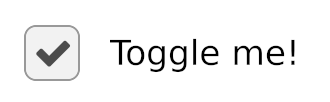 -#[allow(missing_debug_implementations)] -pub struct Checkbox<'a, Message, Renderer> -where - Renderer: text::Renderer, - Renderer::Theme: StyleSheet + widget::text::StyleSheet, -{ - is_checked: bool, - on_toggle: Box<dyn Fn(bool) -> Message + 'a>, - label: String, - width: Length, - size: f32, - spacing: f32, - text_size: Option<f32>, - font: Option<Renderer::Font>, - icon: Icon<Renderer::Font>, - style: <Renderer::Theme as StyleSheet>::Style, -} - -impl<'a, Message, Renderer> Checkbox<'a, Message, Renderer> -where - Renderer: text::Renderer, - Renderer::Theme: StyleSheet + widget::text::StyleSheet, -{ - /// The default size of a [`Checkbox`]. - const DEFAULT_SIZE: f32 = 20.0; - - /// The default spacing of a [`Checkbox`]. - const DEFAULT_SPACING: f32 = 15.0; - - /// Creates a new [`Checkbox`]. - /// - /// It expects: - /// * a boolean describing whether the [`Checkbox`] is checked or not - /// * the label of the [`Checkbox`] - /// * a function that will be called when the [`Checkbox`] is toggled. It - /// will receive the new state of the [`Checkbox`] and must produce a - /// `Message`. - pub fn new<F>(label: impl Into<String>, is_checked: bool, f: F) -> Self - where - F: 'a + Fn(bool) -> Message, - { - Checkbox { - is_checked, - on_toggle: Box::new(f), - label: label.into(), - width: Length::Shrink, - size: Self::DEFAULT_SIZE, - spacing: Self::DEFAULT_SPACING, - text_size: None, - font: None, - icon: Icon { - font: Renderer::ICON_FONT, - code_point: Renderer::CHECKMARK_ICON, - size: None, - }, - style: Default::default(), - } - } - - /// Sets the size of the [`Checkbox`]. - pub fn size(mut self, size: impl Into<Pixels>) -> Self { - self.size = size.into().0; - self - } - - /// Sets the width of the [`Checkbox`]. - pub fn width(mut self, width: impl Into<Length>) -> Self { - self.width = width.into(); - self - } - - /// Sets the spacing between the [`Checkbox`] and the text. - pub fn spacing(mut self, spacing: impl Into<Pixels>) -> Self { - self.spacing = spacing.into().0; - self - } - - /// Sets the text size of the [`Checkbox`]. - pub fn text_size(mut self, text_size: impl Into<Pixels>) -> Self { - self.text_size = Some(text_size.into().0); - self - } - - /// Sets the [`Font`] of the text of the [`Checkbox`]. - /// - /// [`Font`]: crate::text::Renderer::Font - pub fn font(mut self, font: impl Into<Renderer::Font>) -> Self { - self.font = Some(font.into()); - self - } - - /// Sets the [`Icon`] of the [`Checkbox`]. - pub fn icon(mut self, icon: Icon<Renderer::Font>) -> Self { - self.icon = icon; - self - } - - /// Sets the style of the [`Checkbox`]. - pub fn style( - mut self, - style: impl Into<<Renderer::Theme as StyleSheet>::Style>, - ) -> Self { - self.style = style.into(); - self - } -} - -impl<'a, Message, Renderer> Widget<Message, Renderer> - for Checkbox<'a, Message, Renderer> -where - Renderer: text::Renderer, - Renderer::Theme: StyleSheet + widget::text::StyleSheet, -{ - fn width(&self) -> Length { - self.width - } - - fn height(&self) -> Length { - Length::Shrink - } - - fn layout( - &self, - renderer: &Renderer, - limits: &layout::Limits, - ) -> layout::Node { - Row::<(), Renderer>::new() - .width(self.width) - .spacing(self.spacing) - .align_items(Alignment::Center) - .push(Row::new().width(self.size).height(self.size)) - .push( - Text::new(&self.label) - .font(self.font.unwrap_or_else(|| renderer.default_font())) - .width(self.width) - .size( - self.text_size - .unwrap_or_else(|| renderer.default_size()), - ), - ) - .layout(renderer, limits) - } - - fn on_event( - &mut self, - _tree: &mut Tree, - event: Event, - layout: Layout<'_>, - cursor_position: Point, - _renderer: &Renderer, - _clipboard: &mut dyn Clipboard, - shell: &mut Shell<'_, Message>, - ) -> event::Status { - match event { - Event::Mouse(mouse::Event::ButtonPressed(mouse::Button::Left)) - | Event::Touch(touch::Event::FingerPressed { .. }) => { - let mouse_over = layout.bounds().contains(cursor_position); - - if mouse_over { - shell.publish((self.on_toggle)(!self.is_checked)); - - return event::Status::Captured; - } - } - _ => {} - } - - event::Status::Ignored - } - - fn mouse_interaction( - &self, - _tree: &Tree, - layout: Layout<'_>, - cursor_position: Point, - _viewport: &Rectangle, - _renderer: &Renderer, - ) -> mouse::Interaction { - if layout.bounds().contains(cursor_position) { - mouse::Interaction::Pointer - } else { - mouse::Interaction::default() - } - } - - fn draw( - &self, - _tree: &Tree, - renderer: &mut Renderer, - theme: &Renderer::Theme, - style: &renderer::Style, - layout: Layout<'_>, - cursor_position: Point, - _viewport: &Rectangle, - ) { - let bounds = layout.bounds(); - let is_mouse_over = bounds.contains(cursor_position); - - let mut children = layout.children(); - - let custom_style = if is_mouse_over { - theme.hovered(&self.style, self.is_checked) - } else { - theme.active(&self.style, self.is_checked) - }; - - { - let layout = children.next().unwrap(); - let bounds = layout.bounds(); - - renderer.fill_quad( - renderer::Quad { - bounds, - border_radius: custom_style.border_radius.into(), - border_width: custom_style.border_width, - border_color: custom_style.border_color, - }, - custom_style.background, - ); - - let Icon { - font, - code_point, - size, - } = &self.icon; - let size = size.unwrap_or(bounds.height * 0.7); - - if self.is_checked { - renderer.fill_text(text::Text { - content: &code_point.to_string(), - font: *font, - size, - bounds: Rectangle { - x: bounds.center_x(), - y: bounds.center_y(), - ..bounds - }, - color: custom_style.icon_color, - horizontal_alignment: alignment::Horizontal::Center, - vertical_alignment: alignment::Vertical::Center, - }); - } - } - - { - let label_layout = children.next().unwrap(); - - widget::text::draw( - renderer, - style, - label_layout, - &self.label, - self.text_size, - self.font, - widget::text::Appearance { - color: custom_style.text_color, - }, - alignment::Horizontal::Left, - alignment::Vertical::Center, - ); - } - } -} - -impl<'a, Message, Renderer> From<Checkbox<'a, Message, Renderer>> - for Element<'a, Message, Renderer> -where - Message: 'a, - Renderer: 'a + text::Renderer, - Renderer::Theme: StyleSheet + widget::text::StyleSheet, -{ - fn from( - checkbox: Checkbox<'a, Message, Renderer>, - ) -> Element<'a, Message, Renderer> { - Element::new(checkbox) - } -} |